
Artefact - Roy Lichtenstein's "Girl with a hair ribbon"
The Man
Roy Lichtenstein was born into a middle class family during October 1923 in New York City. During his junior year at high school despite art not being a part of the curriculum Lichtenstein took up drawing and painting as a hobby finding his inspiration from Jazz musicians. In 1939 he enrolled for summer art classes under Reginald Marsh. During this time his work was strongly influenced by that of Marsh. After graduation he decided to study Fine Arts at the Ohio state university although he was detracted from his work when he was drafted by the army. Although he was serving he still kept himself creative and art never left his heart. When he was demobilized he quickly returned to finish his course and gained his Bachelor of fine arts in June. In 1949 he achieved his master of fine art and held his first exhibition at the Ten Thirty Gallery in Cleveland.
In 1960 he was appointed Assistant professor at the Douglas college at Rutgers University of New Jersey. During his time there he met many people including Allan Kaprow, Caels Oldenburg, Jim Dine, Lucas Samaras and George Segal. Through these people he attended many “happenings” but never took part but his interest in pop art was revived. (His only previous pop art painting was a dollar bill made in 156)
One of the main inspirations for his pop art work was a challenge put to him by his son who pointed to a Mickey Mouse comic book and said “I bet you can’t draw as good as that”. Then in 1961 he created 6 paintings which used comic books as the subject with only slight modifications to form and colour. It was at this time he used what really gave his work a unique touch Ben Day dots, Speech balloons and words.
Lichtenstein is remembered for his pop art but he was not always a pop artist. His early work was very abstract and when he was in the army he did a lot of drawings based on what he could see in nature. After leading such an interesting life studying fine art, creating many painting that went on exhibition and surviving a war and Roy Lichtenstein died in September 1997.
The Art
There are many things that define Lichtenstein’s work but nothing more than how he took existing comic books and using bold colours and his stylised dots to recreate them on canvas. His paintings were physical productions of how he saw a comic and how he manipulated it in his own mind to satisfy his own desires; I’m sure we have all taken our favourite comic book characters and put them in to our own stories before.
Something Lichtenstein was not afraid to do was to change things, if you look at his original material you can see this very clearly. The changes he made were either to the colour, adjustments to the objects or people in the image or the removal or insertion of text. By doing this Lichtenstein made his paintings bolder and more dramatic.
The use of dots was something very unique to Lichtenstein’s paintings, the accuracy he had achieved with them was incredible and they looked effective both close up and from a distance. After talking with lectures and a few other people the only logical way I can see for Lichtenstein to be able to make these dots is by using a stencil. The dots in his paintings were very important as they represented the Ben Day dot method of printing comics and other media
Ben Day Dots are a method of printing media such as comic books, newspapers etc. The idea s that dot of the 3 printing colours magenta, cyan, yellow and black were overlaid on top of one another to create different colours. It was used in comic books as it was cheaper than printing solid colour. Lichtenstein’s interpretation of these dots give the same kind of effect but as he painted on very large canvas you need to stand quite far back to see the effect happen.
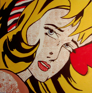
Lichtenstein’s painting Girl with a hair ribbon is a perfect example of how Lichtenstein worked. The pose was already dramatic but by taking the words away that explained the situation he was able to create pose that could convey a number of emotions such as shock, fear, confusion etc. In the original comic image the woman had black hair which would have made the painting very dark and stray from Lichtenstein’s style so he gave her blonde hair but still left lots of black shadows in it. He also removed a bow from her shoulder which is probably why he gave her a hair band.
The Work
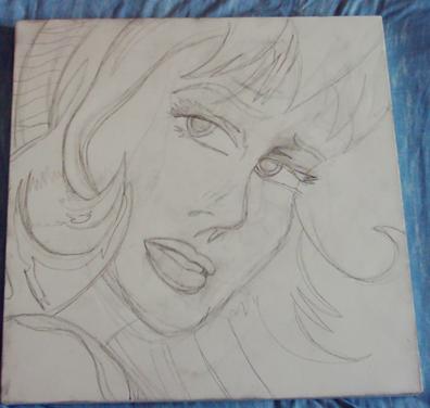
The original Girl with a hair ribbon was painted with Oils and magna on a 120cm x 120cm canvas. Unfortunately due to money and reality my version will be slightly toned down using only a 47cm by 47cm canvas with acrylic paints. I used acrylic paint because it is similar to oils but instead of being oil based it is water based.
I have got my canvas, I have got my paint, time to do a practice drawing in my work book else I’m likely to make a big mess of all this. Although I’m confident I can recreate the image to a reasonable degree I think that a practice or two will help me figure out how the real thing will go. Hopefully it will be easy enough to blow it up to larger scale but only time will tell.
I had suggested to me that I should draw the image onto the canvas using a grid of squares but that didn’t really seem too professional, I can imagine a professional artist tracing an image by someone else or using a grid to copy it so I drew it free hand. The first attempt was a bit of a disaster but after looking at it for the flaws I had made I re primed the canvas and gave it another shot with much better results. Although my rendition is not perfect it seems quite accurate to how Lichtenstein would recreate the comics as he would change the form slightly as well. But oh no I’m being drafted into the army; well I’m going to play Medal of Honor if that counts.
The block colour should be quite easy but the dots will most likely cause some problems. I’m going to rough paint the black lines in first so that I have a guide to work to. Then do the block colours (yellow and red) then the dreaded dots. After that clean up the black lines and get it looking smart.
The lines and block colours worked out pretty well and the black and colour is making the painting look more and more promising. I’m going to need to put a few more coats on the bold colours as the pencil is still showing through a bit, probably because the yellow is so light. This is the first time I’ve done a painting on canvas and it has been very strange I have to say. The paint didn’t flow as easily as I thought it would and when I added a drop of water to thin it down a bit I found all it did was make the paint more see through. But then I don’t suppose that matters so much at this stage.
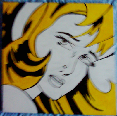
It’s all starting to come together now the main bold colours are on and now its just those pesky dots left to go. I tried to make a large stencil but it was terribly in accurate despite using a grid. I have selected a part of the stencil that was as accurate as it could get and used that repeatedly to make the dots, unfortunately the dots smudged in a few places and started coming out in different sizes. The over all effect is ok but it all went a bit funky towards the end. I have redone the black lines despite this as I don’t have anymore plastic to make a new stencil and I think it will only turn out as before.
Evaluation
Dots were the main let down on this painting. Not only did the sizes differ all over the face and shoulder but they also smudge and didnt line up very well in places. I think that I was maybe a bit quick to start painting the on and that if I had spent more time making an accurate stencil it would have came out better. My friend said to me after I had one the dots Why nor use some mesh from a hardware store? Which really begs the question why didnt I think of that in the first place?!
The over all proportions of the painting I think turned out good despite my first mess up. The size of the image was a bit off putting but after I looked at it as a whole rather than in little bits I was able to make some judgements as to where things should go and how they should be. The black lines and highlights are what really bring this painting together kind of like the glue that binds the large colour areas together.
I think if doing something like this again especially with the dots I would most defiantly try to find something machine made to use as a stencil and spend more time painting them on to the canvas making it as accurate as possible. However I really enjoyed doing it and might even try my hand at painting just for fun sometime in the future.